Oxbridge Home Learning
An online education provider was losing 96% of sessions before add-to-cart. A structured testing programme produced six winning experiments and up to +44% revenue.

Oxbridge Home Learning is an online education provider offering flexible courses (GCSEs, A-levels and professional qualifications) with personalised tutor support for distance learners.
The goal was to increase conversion rate by 30% in six months by optimising the funnel from course pages to checkout. That meant analysing funnel performance, finding drop-off points, simplifying enrolment, and improving the bottom-of-funnel experience for prospective students.
- 1
Analysed the full purchase funnel in GA4 to quantify drop-off at each stage.
- 2
Used Clarity heatmaps and session recordings to see where users hesitated and got lost.
- 3
Prioritised a mix of high-impact tests and quick wins for efficient, continuous testing.
- 4
Ran structured A/B tests across course pages, checkout, the product buybox, navigation and sitewide USPs.
96% never reach add-to-cart
Analytics revealed 96% of sessions didn't progress to 'add to cart', the single biggest drop-off in the entire funnel.
Traffic concentrated on top courses
A handful of course pages attracted most of the traffic with only moderate engagement, a clear chance to optimise the highest-value pages first.
Drop-off on key pages
50% of users abandoned the homepage after the second fold; on course pages 25% left after the add-to-cart button and 50% never reached the reviews.
The numbers moved
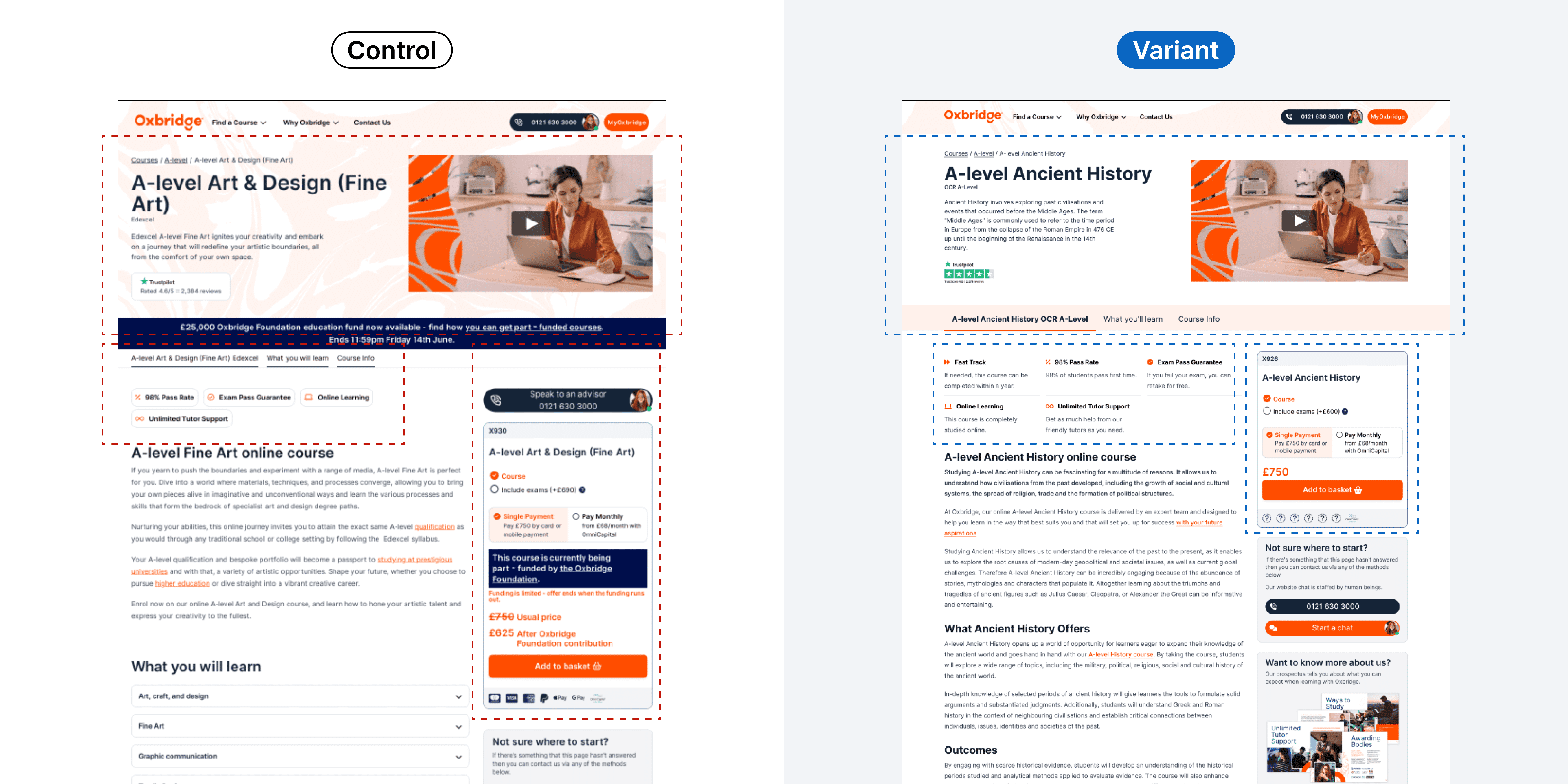
Course page: above the fold
Redesigning the above-the-fold layout and content on course pages will reduce confusion and increase engagement, cutting the 96% drop-off and lifting enrolments.
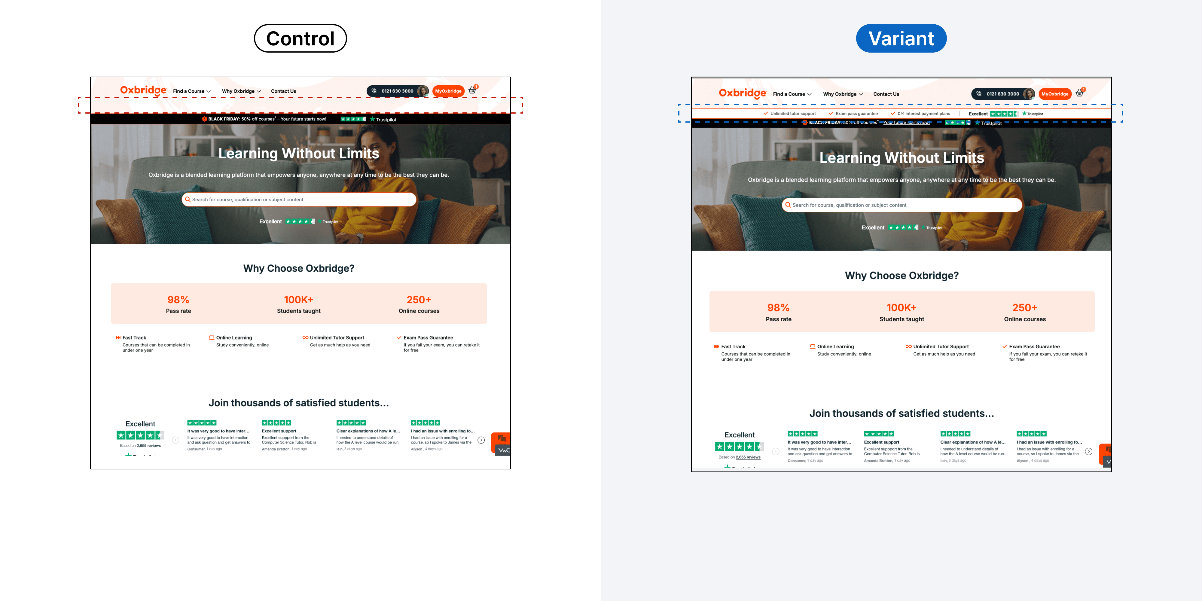
Sitewide: USP bar
Adding prominent USPs directly below the header will improve clarity on the site's value, differentiate the brand and better inform decisions.
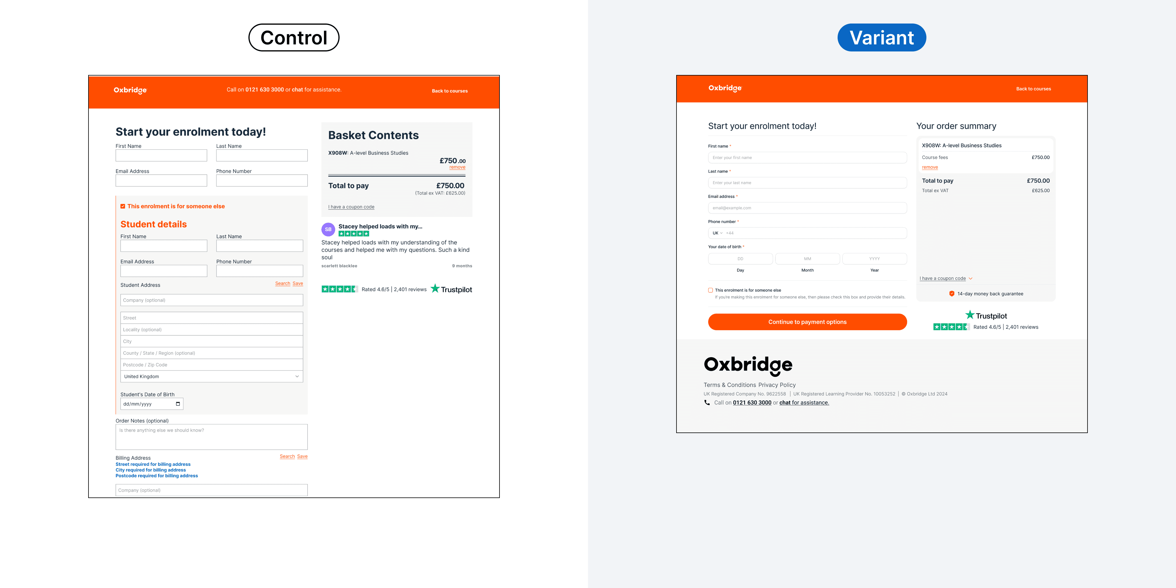
Checkout: flow redesign
Streamlining checkout with clearer CTAs, intuitive student-info steps, transparent pricing and trust signals will increase completion and reduce abandonment.
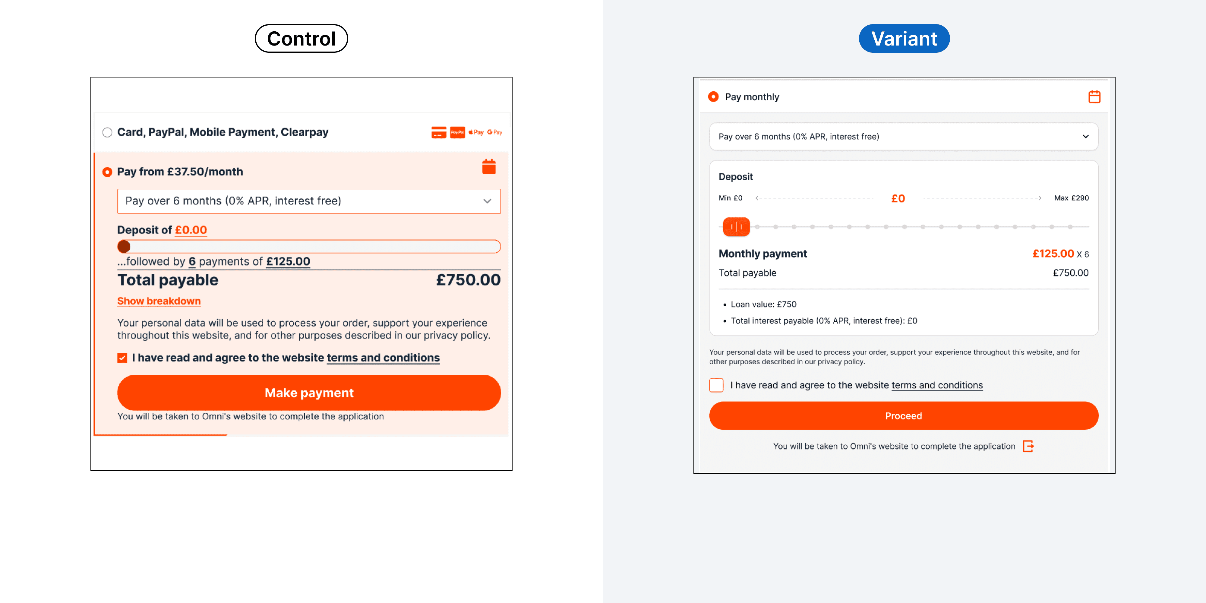
Checkout: monthly payment method
Improving visual hierarchy, language, form usability and trust signals for online payments will reduce confusion and lift completed payment forms.
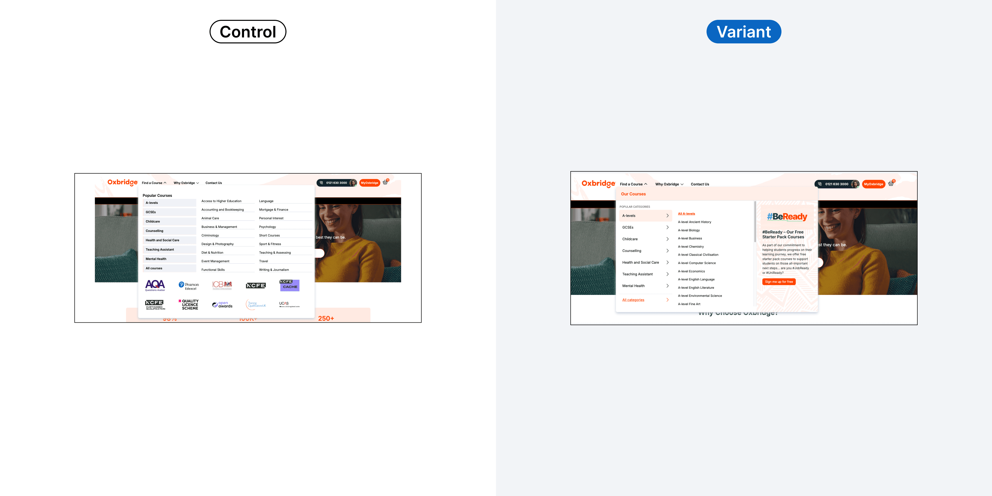
Sitewide: navigation menu
Simplifying navigation so users find courses in fewer clicks will reduce friction and improve enrolment conversions.
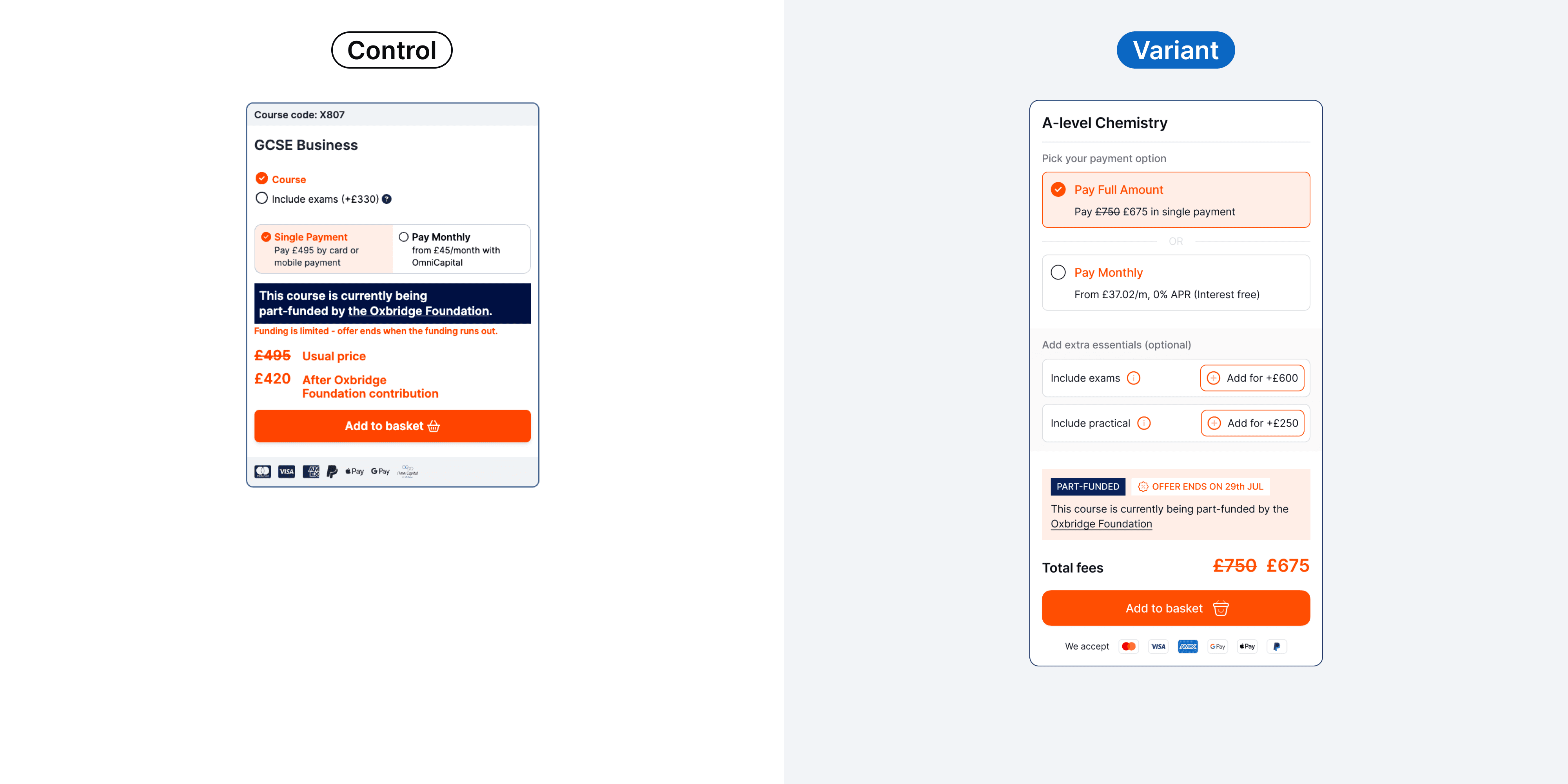
Product page: buybox
Clarifying cost structure, boosting CTA visibility and highlighting payment options in the buybox will increase purchase confidence and conversion.
“Syed is great to work with. He understands what works on websites and is dedicated to understanding user behaviour. Collaboration with Syed is easy and got us brilliant results.”

More work
Other case studies
Let's optimise together ✨
Ready to turn more of your traffic into revenue?
Message me on WhatsApp, or book a free 30-minute call and I'll look at your highest-value page and show you exactly where you're leaving money on the table. No pitch, no obligation.
- A quick teardown of your key funnel
- Test ideas you can action right away
- Clarity on where CRO can move the needle